GoCatch mobile app UX Design and UI Design for new flows and data input
While working on contract as GoCatch’s Design Lead in 2015 there were ongoing improvements with the app that required User Experience (UX) flow enhancements and additions, as well as new User Interface (UI) design to clarify areas of the app. Some of these were implemented and some were parked lower on the priority list to complete. These included revising sign up UX design flows and UI design enhancements to the old look. There was also new data that was required to be input by the user when booking taxis, and the inputs were going to become more and more complex in the future. So a simple system was created to accommodate an unknown number of additional data types.

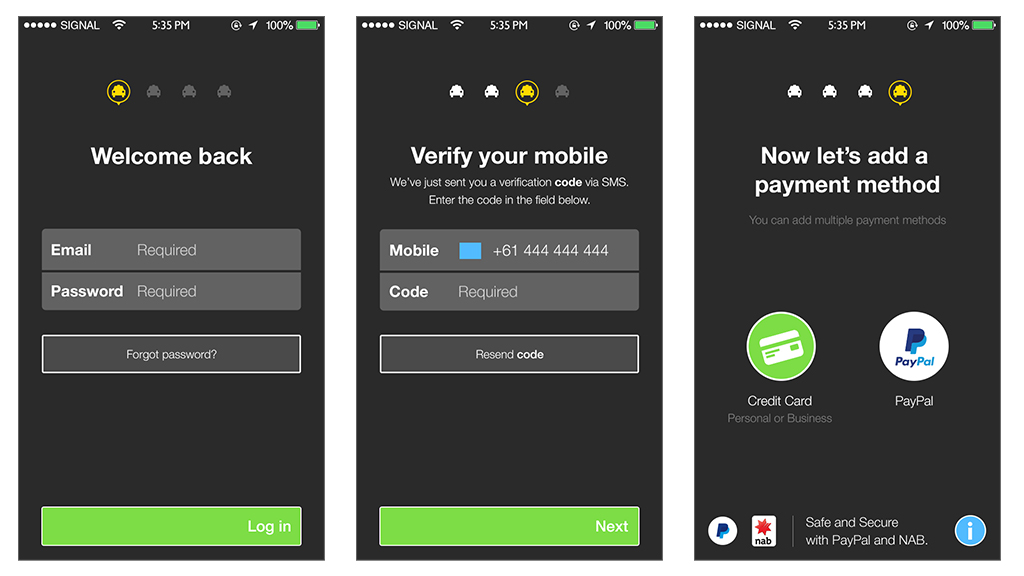
Simplifying the sign up and login process was a huge issue. I proposed that GoCatch use one system that was a two step process. First provide your email, then if the system returned that email exiswted you were taken to the login flow. If the email didn’t exist you started the sign up flow. This removes the confusion that users encounter with many apps and sites, between signing up or logging in.

Creating clear differentiation between different types of credit cards were an important step, also showing people at the right time that more than one card was acceptable.

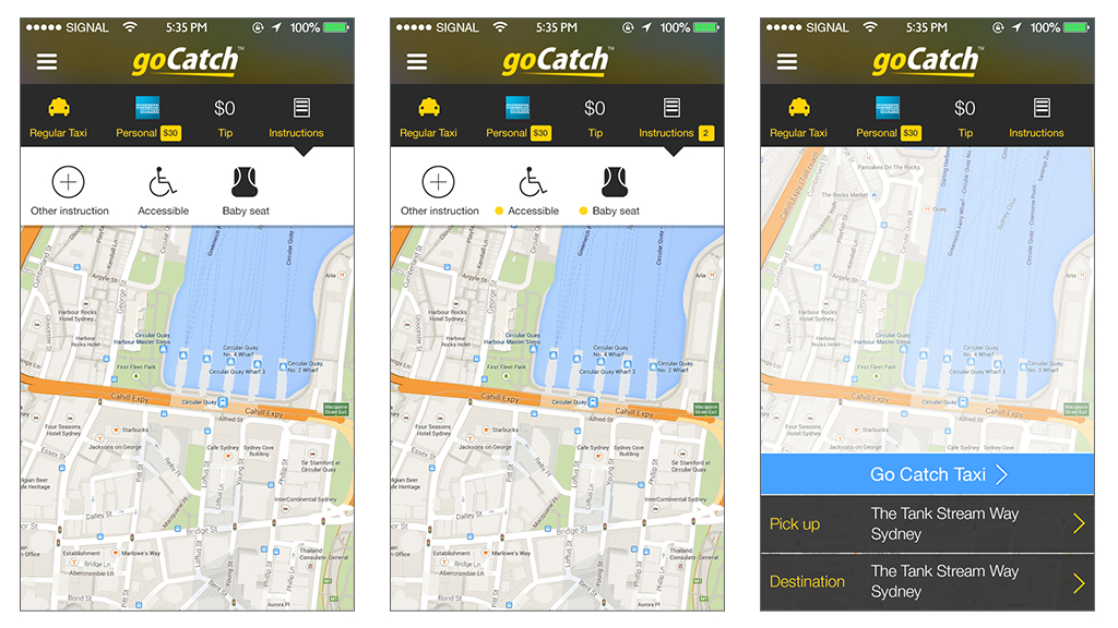
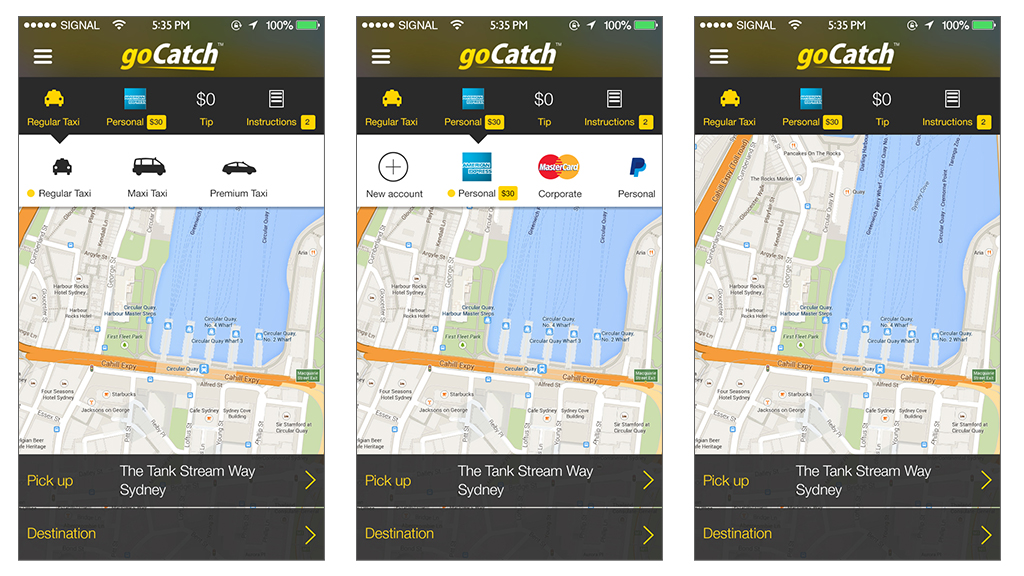
The default screens of the GoCatch app needed to start accommodating more options yet not overtake the main purpose of the screen. Menus were designed to drop down and then tuck away once completed. The bar at the top of the map updated to show your selected options, so at a glance, while booking your taxi on a busy street, you’d know exactly what’s happening and can update quickly while not leaving the main screen.


